
Print Ship USA
5/18/2026
The Power of a Great Business Card
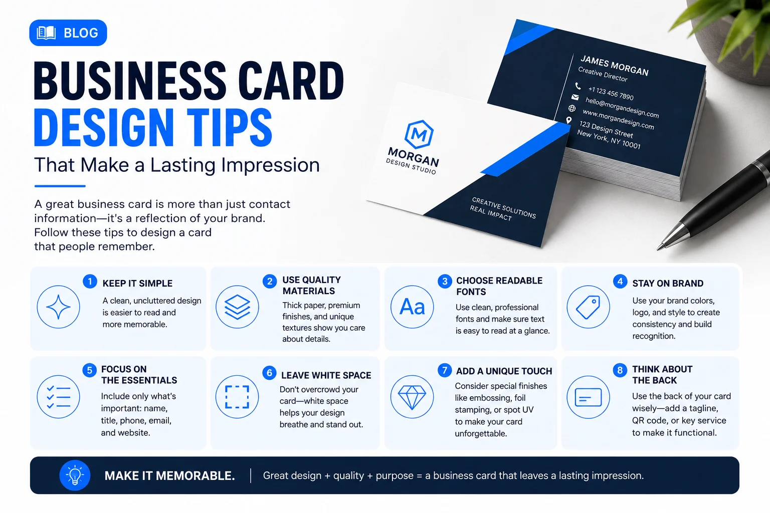
In our increasingly digital world, a physical business card remains one of the most powerful networking tools. Handing someone a beautifully designed, high-quality card makes a tangible connection and leaves a lasting impression. But with so many cards out there, how do you make yours stand out? Here are essential design tips for creating a memorable business card.
1. Keep It Simple and Uncluttered
A business card has a small canvas, typically 3.5 x 2 inches. Resist the urge to cram every piece of information onto it. The best business cards are clean, minimalist, and easy to read.
Include only the essentials: your name, your title, your company name/logo, and your most direct contact information (phone, email, website). Leave plenty of negative space (empty space) around your text and logo to let the design breathe.
2. Choose the Right Typography
Typography sets the tone for your brand. Use fonts that are legible and professional. As a rule of thumb, use no more than two different fonts on your card—one for your name or logo, and another for the contact details.
Ensure the font size is readable. Your name can be larger, but your contact info shouldn't be smaller than 7pt or 8pt. Avoid overly decorative fonts for the small text, as they can become unreadable when printed.
3. Utilize the Back of the Card
Don't leave the back of your card blank! This is prime real estate. Use the back for a large, striking version of your logo, a captivating image, your company tagline, or even a useful calendar or discount code.
A double-sided card looks more professional and gives you the opportunity to convey more about your brand without cluttering the front.
4. Understand Print Finishes
The tactile experience of a business card is just as important as the visual design. Consider upgrading from standard paper to something more premium.
- Matte or Soft Touch: Offers a smooth, elegant feel.
- Glossy: Makes colors pop and adds durability.
- Foil Stamping: Adds metallic accents (gold, silver, rose gold) for a luxurious look.
- Spot UV: Applies a glossy finish to specific areas (like your logo) to make them stand out against a matte background.
- Embossing/Debossing: Creates a raised or recessed texture.
5. Don't Forget the Basics: Bleed and Safe Area
When designing your card, remember the technical requirements for printing. Ensure your background colors or images extend into the "bleed" area (usually 1/8 inch beyond the final size) so there are no white edges after cutting.
Keep all important text within the "safe zone" (1/8 inch inside the cut line) so nothing crucial gets sliced off during the trimming process. A well-designed card means nothing if the phone number is missing!